Re: [tlhIngan Hol] Simple pIqaD typeface

Thanks, naHQun and Qunchuy; this is exactly the type of feedback I was looking for. Alan Anderson <qunchuy@alcaco.net> wrote:
I don't see the essential features I expect from {r}, and the {tlh} is tilted weirdly to the left. I recognize the {ch}/{tlh} similarity, but I think it's overdone.
Thanks. I flipped the direction of the curve of the lower part of {r} and extended it outwards to hopefully let it look more familiar. As for {tlh}, yes, I was going for a reuse of the top part of {ch}, and just changed the curve of the right side. I’ve redrawn it to still use the “hook” from {ch} but with a larger and more pointed to the right bowl. Here’s a screenshot with the current letter shapes; I’ll wait another couple of days for additional feedback, and hopefully have a font to share with everyone within the next couple of weeks. Not sure how well image attachments work on this list or how much people like/hate them; if it doesn’t display, try: https://imgur.com/a/5h6Eo
And am I the only person who believes {ch} and {ng} are basically the same shape with a 90 degree rotation?
I can see where you’re going with that, but to me, the upward facing bowl in {ch} dominates in a way that the corresponding feature in {ng} doesn’t. To my eye, the resemblance between {ng} and {o} is stronger, which is why they share the same basic shape. (I also used {o} as a basis for {r}, which is probably what made it look weird to you.) Michael Roney, Jr. <nahqun@gmail.com> wrote:
I expected the top of the {D} to be more "up", more "perky"? but that is just what I expected to see, it doesn't mean your {D} is wrong or that you should change it. I learned to write pIqaD from a font more suited to engraving, and it had the tip pointing straight up, so that probably where I get that bias.
Yeah, as Qunchuy pointed out, the {D} and {y} are actually the same shape. My sense is that {D} should point a little more “up”, and the line on the right side of the loop of {y} should be a little more vertical, and the angle they’re both set at is a bit of a compromise to allow them to be 180° rotations of each other rather than some weird angle.
I also expected the lower curve of the {H} to look different. I don't know if I expected it to be rounder or longer or curvier, it just seemed... off.
I think it’s an artifact of the fact that {H} is a closed off {m}, and the left side of both shares a shape with {b}, {n}, and {q}. I also feel that maybe the leg could be a little longer, but I’ve chosen to leave it as-is.
If you are going to release this publicly as a font, please use a more unique name than "pIqaD.ttf" as I'm tired of having to rename fonts before I install them.
Indeed. :) I haven’t found any existing fonts called “pIqaD nap”, so unless someone points out that this name has already been used, or doesn’t mean what I intend it to (“simple pIqaD”), that’s the name I’m going with.
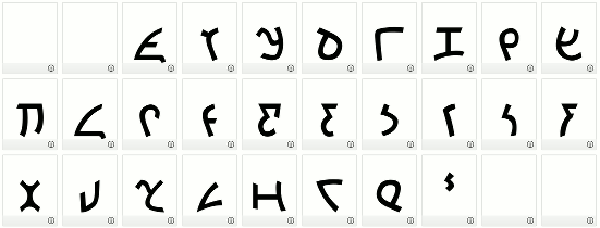

On Sun, Feb 4, 2018 at 9:54 PM, Daniel Dadap <daniel@dadap.net> wrote:
Thanks. I flipped the direction of the curve of the lower part of {r} and extended it outwards to hopefully let it look more familiar. As for {tlh}, yes, I was going for a reuse of the top part of {ch}, and just changed the curve of the right side. I’ve redrawn it to still use the “hook” from {ch} but with a larger and more pointed to the right bowl.
They both now look comfortably familiar to me. I put a small left-pointing serif on the upper right arm when I write {tlh}, but it's not something I believe is a necessary part of the letterform.
I’ll wait another couple of days for additional feedback,...
There's something odd about the {p}. I expect the left bar to extend below the start of the curve, or at least have a much sharper bend where the two meet. If you're going for simplicity, I think the extra downturn at the right of {a} and {l} seems slightly out of place. I'm also accustomed to a straight left line on both. They're perfectly recognizable as you have them, though. -- ghunchu'wI'
Thanks again! I really appreciate the feedback; I’ve gotten so used to the shapes as I’ve drawn them that having people who have never seen them pick a few nits has helped me more clearly see features that I’ve overlooked.
On Feb 4, 2018, at 22:12, Alan Anderson <qunchuy@alcaco.net> wrote:
I put a small left-pointing serif on the upper right arm when I write {tlh}, but it's not something I believe is a necessary part of the letterform.
Hmm, I see that now - I hadn’t noticed it before. I think I’ll leave it off.
There's something odd about the {p}. I expect the left bar to extend below the start of the curve, or at least have a much sharper bend where the two meet.
Yeah, the basic forms are derived from my own handwritten pIqaD style that I developed after doing some minimal research into how people hand write pIqaD and finding that there really isn’t any standard way to do it. I write my {p} with a single stroke, but looking at the “traditional” form I do see that the bar extends all the way. I’ll perhaps look into steepening the bend a little. I want to tweak the glyphs to have more consistent stroke widths anyway, so I might play with some of the shapes more when doing that.
If you're going for simplicity, I think the extra downturn at the right of {a} and {l} seems slightly out of place. I'm also accustomed to a straight left line on both. They're perfectly recognizable as you have them, though.
That’s another feature from my handwritten style, which I use to keep {l} from looking too much like {u}, since I didn’t want to rely on just the angle of the lines when dealing with the inconsistency of hand writing the glyphs. Since {a} has the same basic shape as {l}, it gets it too. It’s probably not needed in a computerized typeface, but I’ve grown used to it. Maybe I can make it a little less prominent, though it’s already a toned down version of what I draw by hand. As for the curve on the left line, I’m not sure where that came from. It seems that I’ve drawn it that way from very early on. My best guess is that I saw the straight diagonal line that flattens out to horizontal at the top as a curve for some reason, but looking at the “traditional” forms more critically I can now clearly see that it’s straight. I’ll experiment with a flatter diagonal that levels off and see which I like better. I think I want {l} to be a flipped {w} too (with {w} losing the downturn on {l} if I keep it), so the final shape may be a compromise between the curve of {w} (which I exaggerate to prevent it from looking too much like {e}), and the bent line of {l}. Or I might just keep {l} and {a} curvy like {w}. As you noticed, I like to reuse shapes where I can. That’s one of the things I like about the HaSta font, although I think it goes a little too far in using the {a} and {l} shape for {Q} and {o}, and borderline too far in using it for {tlh}. ({tlh} in that font might work better for me if the spur on the left were a little more pronounced.) Of course, what features we see in each of the glyphs is purely subjective, which is why I’ve reached out to Klingonists (here and on the tlhInganHol subreddit) for their impressions, since my subspace transceiver isn’t working and I can’t check in with native readers on Qo'noS. :) One last question for Qunchuy and naHQun (“God’s sneeze” and “God of fruit”, respectively?): I plan on acknowledging those who provided feedback when I eventually publish the font; do you prefer to be acknowledged by Klingon name, Human name, or both? (Please answer individually; I’ll reach out individually if I don’t hear back here, and make an arbitrary decision if I don’t hear back after that.) Anybody else who cares to comment on the font - let me know that ad well, please. - DanIlmoH machel puqloD DapDap tuq
Here’s an updated version incorporating some of Qunchuy’s secord round of feedback. (I’m not going to bother attempting to attach the image this time.) https://imgur.com/a/fIFCG <https://imgur.com/a/fIFCG> I tweaked many of the glyphs slightly to make the strokes more uniform in thickness, and to move features in some glyphs to align better with unrelated features in other glyphs, but the biggest changes were to {a}, {l}, {p}, and {4}. I liked the way {a}, {l}, and {4} looked wen I used rotations/flips of {w} for their basic shapes. The left side stroke on {a} and {l} is still curved, but the curve is a lot more subdued now. Let me know if anybody sees anything that they feel strays too far from what their internal conception of any particular glyph may be. Thanks again, DanIlmoH machel puqloD DapDap tuq

On 5 February 2018 at 03:54, Daniel Dadap <daniel@dadap.net> wrote:
Here’s a screenshot with the current letter shapes; I’ll wait another couple of days for additional feedback, and hopefully have a font to share with everyone within the next couple of weeks.
Not sure how well image attachments work on this list or how much people like/hate them; if it doesn’t display, try: https://imgur.com/a/5h6Eo
I did not see any image in that message (nor in any other message of yours), neither in-line nor as an attachment (there was only a "signature.asc" attachment), so the answer to "how well image attachments work" seems to be "not at all, or at least not reliably". Ph.
participants (3)
-
 Alan Anderson
 -
 Daniel Dadap
 -
 Philip Newton